
Saving Halloween with Data Science (Starring Bart Simpson)
It's spoooooky season which means warm jumpers, pumpkin spice and the terrifying treachery of the Simpsons Treehouse of horror! And Bart's pretty good at coming up with spooky stories at this point, but is he any good at trick or treating? Let's use data science to find out.
Finding the Data to do the Data Science With
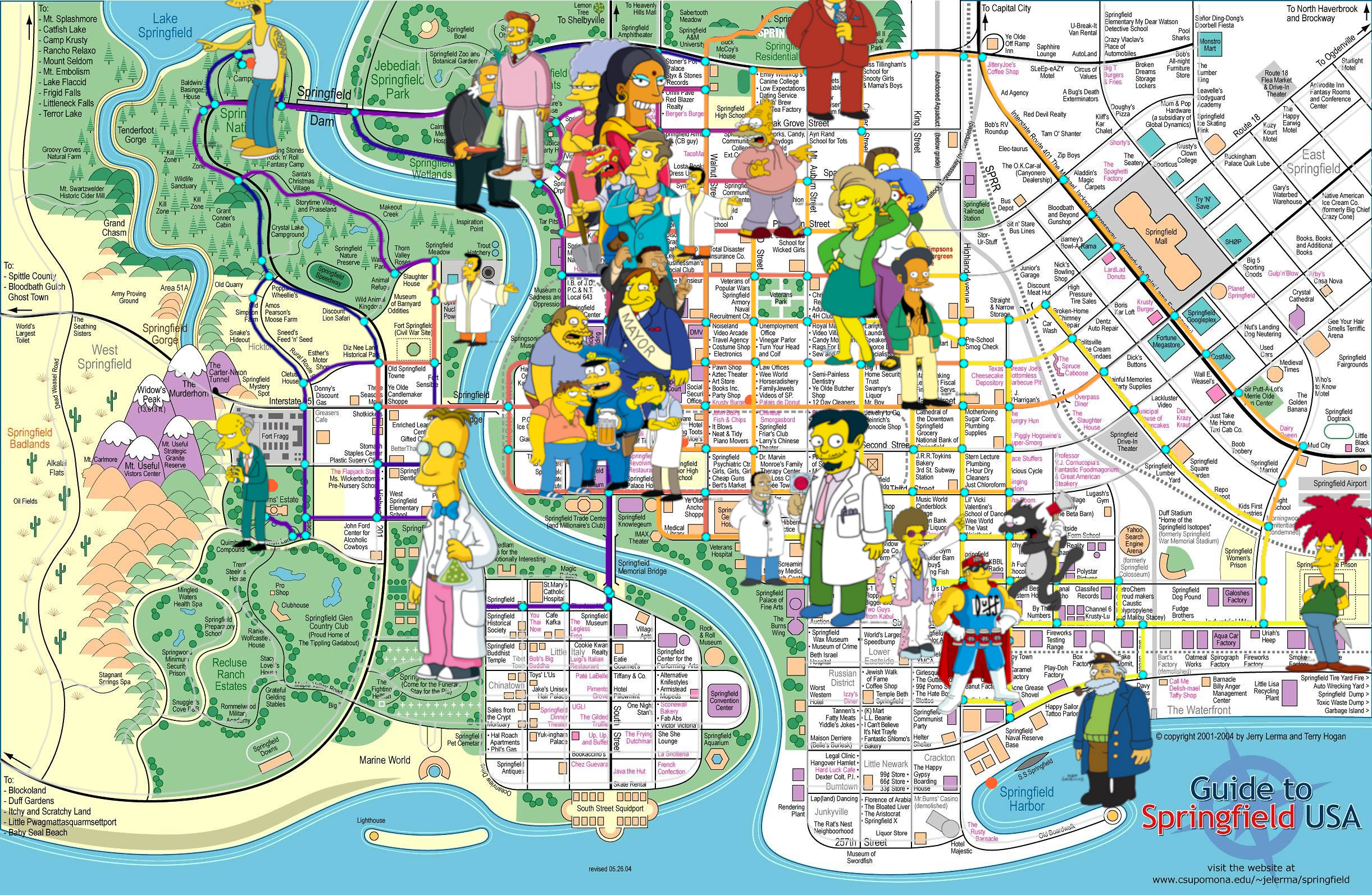
So the first and hardest step in any data science problem is not the data science unfortunately, it’s finding the data. But I was lucky, I had an idea for that already: My “We don’t want you playing violent games” GTA equivalent: The Simpsons Hit and Run. But while the game is iconic, and the cars break down in such a satisfying way, the maps are a bit simplistic, a bit abstract and not really data science worthy.
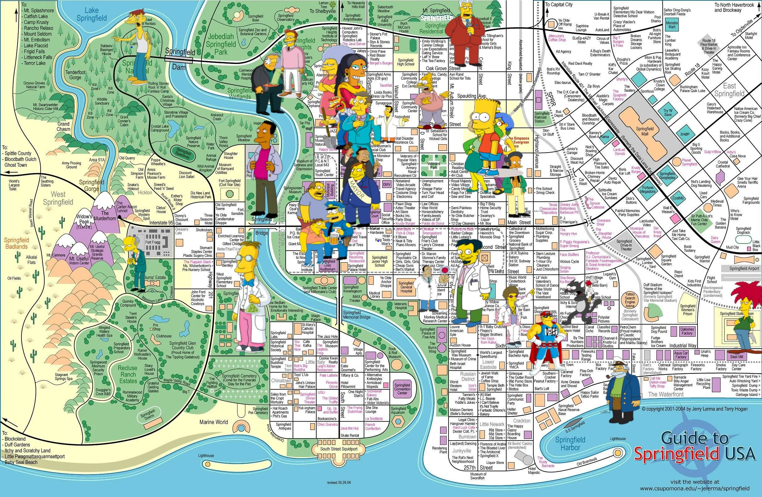
I considered a detour to Pawnee, and believe me I wanted to get my Knope on but Parks and Rec fans apparently aren’t map nerds because no one has made one of Pawnee yet. But you Simpsons nerds, you’re built differently, and I found on reddit a pre-created, exceptionally detailed work of art that gives me exactly what I needed: Every location in Springfield, labelled and plotted.
This is where the project felt suspiciously easy. I had my map, but I quickly hit my first trick of this Halloween video: I had to read the whole thing and mark out every single character's location myself. You might be thinking, "Why not just ask your favorite AI to do it?" I did. And they were rubbish. So it was back to me.
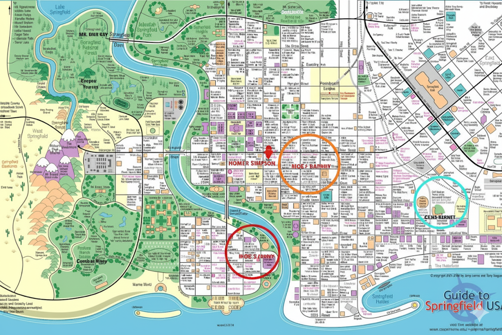
Not only was the AI map completely readable, but Homer Simpson was nowhere near Evergreen Terrace and it gave us both “Moe & Barney” and “Moe’s Irony” and I don’t really know what that last one is meant to mean but I only need at most one Moe!!!
I spent I don't want to know how long meticulously marking every single character location by hand. And just when I thought I was done, triumphantly sitting back with my nodes saved in a GIMP image editor, I found my second problem: to use this data in Python, I needed to do the whole thing again in a vector-based tool.
So I took a crash course in Inkscape. I'm definitely not a graphic artist now, but after a lot of trial and error, I had a new, beautiful set of data points that a computer could actually understand. See, I’m resourceful. I did get my Knope on after all. But my triumph was about to unravel again…
Because I was tens of hours into this project, proudly showing everyone who would pay attention how I’d managed to get all my 32 Simpsons characters plotted beautifully on my map before I realised… Uh… Moe Tavern is closed. It failed its health inspection. He’s not giving out Candy this year and I’m not going to try and find out why. Let’s move on.
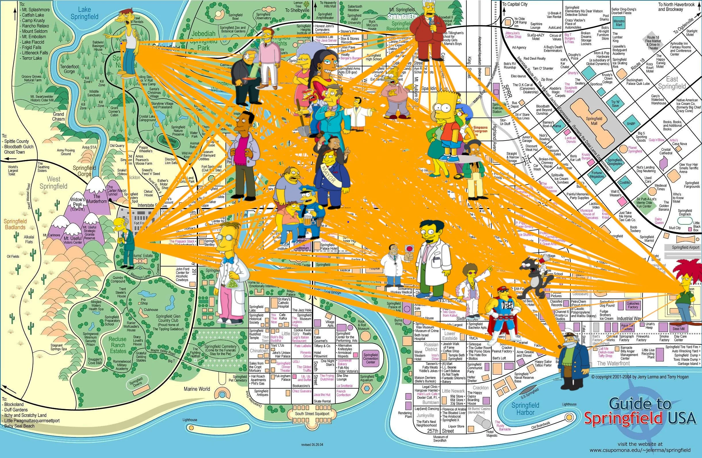
LOOK at this work of art I made!! (I also now understand what Moe’s Irony means…)
Building The Simpsons Graph
So with 31 Simpsons characters plotted beautifully on a map I was ready to start asking the important questions. Because it’s not just distance that matters when you go on a candy collecting spree - any noob can find the perfect route for that. No, it’s eating so many sweets that you throw up… and avoiding certain pitfalls along the way.

Come on Bart… We cant stop trick or treating now!
So plotting 31 characters on a map is all well and good, but in order to make a potential trick or treating route we need to be able to join them up. Like this image of them all connected below. This graph is saying basically that each character has a path that gets them to every other character. No one is hanging out on their own, except Moe, which is good, means we can go ask them for candy.
But in reality this simple starting point is unrealistic. Other than a basic check that we can actually get to everyone, this doesn’t really tell us anything else.
Creating a Realistic Representation of Springfield
One thing we can do is add weight to the path, so distances that are further away have a thicker line. And okay visually the fact I’ve lined everyone up on top of their locations on the map means you can see that Mr Burns doesn’t live with the plebians but the computer doesn’t know that, it depends on paths to get around.
Simpsons Map with connected characters
I did notice when I zoomed in that something weird was going on around Evergreen Terrace. I’m pretty sure Ned next door is closer than Milhouse over the road, but maybe this’ll make a bit more sense after I’ve made some more changes. We’ll come back to this one.

Difference in distance between The Flanders, Milhouse and The Simpsons
So this gets closer to something we can work with, it certainly symbolises what we want to do but we still have a problem. This map depicts distances as the crow flies, straight lines between the two points regardless of anything in between, and last time I checked, Bart can’t ollie over buildings.
Euclidean Distance vs Manhattan Distance
So if we think about real world maps, when you ask Google for directions, it doesn’t draw you a straight line and hope you work it out. It gives you the left and right turns you need to get to where you need to go. It plots a path for you. And often it gives you multiple options. If you want to avoid traffic on Abbey Road because everyone is queuing to take a picture on the crossing, you can go via Grove End Road or Hamilton Terrace instead.
Similarly when we think of the lines connecting each character on our Simpsons graph, there are actually multiple paths in which one character can take to get to another. So we can’t just draw lines between the characters, we actually need to map out every single intersection and road segment.
Three valid paths to get between Cletus and Mr Burns
And this is where things start to get a little crazy. Because so far, to do the crow flies route we’re taking the Euclidean distance, ie square root of the change in x coordinate squared plus the change in y coordinate squared. But in order to calculate the path Bart will actually take, we need the Manhattan distance, literally following the roads like the grids of Manhattan. That way we can plot a graph that looks like the crows fly version I showed you earlier but with Manhattan distances. Makes for easier maths and visualisation but keeps the integrity of the actual paths. The only problem is building it.

How to calculate the Euclidean Distance

How to calculate the Manhattan Distance
Because in order to make that happen, we actually need to build a more complex graph first, one in which every single intersection is taken into account. And let me tell you, getting this right drove me up the wall. With over a hundred paths intersecting at multiple points, the problem gets exponentially bigger and well, if you really want a scare this Halloween, here’s what that graph looks like:

You’re welcome for this jump scare. We know you love it.
When you see this you understand immediately one of the biggest challenges in data science: sometimes you have to simplify the problem to solve it.
By the way, if messy data like this gives you a jump scare, Join the Evil Lair to find out about all the teaching and tooling we’re doing to make data science a lot less scary. Details in the description.

Join our Evil Lair
Building a Simplified Model
So how do we get from that jump scare to something manageable? Well if we know the path from Cletus to Mr Burns, we can take out all of these intermediate intersections from our graph and just plot a straight line between the two as long as we give it the distance calculated by the Manhattan distance. But we’ve seen the problem with this already: There are multiple ways to get to Mr Burns from Cletus. Some are reasonable with slight variations but it is absolutely possible to walk from Cletus to every single node on this map before finally reaching Mr Burns. It’s a valid path but Bart would need far more candy than he’d get to keep up the calories to follow this one.
In reality, if we want Bart to optimise his trick or treating route, we need to cut down on the time he spends wandering the streets of Springfield. And the way we do that is to calculate the shortest path between each set of characters.
Now this sounds complicated, and it’s even worse when I tell you this is using something called Dijkstra’s algorithm, but I’m not going to save the deep dive into how this works another day because there are libraries with efficient implementations already and in practice you’ll just end up using them. But what you need to know for today is that it’s an algorithm designed to find the shortest route between each point and by using that for every pair of characters, I can build a graph with lines connecting only the characters and weights given by the Manhattan distances.
We can calculate the shortest route between every pair of characters…
… and replace those paths with straight lines of the same length. Now it’s something we can work with.
So like in most of our data science blogs, a huge chunk of the video has been getting the data clean and usable but now we can actually start to do the modelling. Don’t ever tell us we hide the glamour of data science.
So how do we get to the exciting part of actually trick or treating? Well in order to do this we need to introduce the concepts of rewards and penalties. Wait, isn’t that basically what trick or treating is?

Cleaning up the data
Data Science Rewards and Penalties, the allegory for Trick or Treating
So obviously the treats are rewards. We want Bart to maximise the candy he receives so for characters likely to give out more treats, we give them a higher reward score. Similarly, there are characters who just hate children in general and Bart in specific. These ones Bart might want to avoid because he’ll get nothing, I mean Principle Skinner is not rewarding that boy with chocolate, or it might even be actively harmful to go their way. Sideshow Bob might steal all his candy. Or worse.
So I asked a Simpsons enthusiast to score the characters for me. He gave me justifications for his choices, like Professor Frink would be enthusiastic to give out candy because it’s probably some experimental stuff that he wants real people to try. And Krusty definitely has a soft spot for Bart. These two are scored pretty high at about a 7. Sideshow Bob? He’s a minus twenty. Don’t go near Sideshow Bob.
Which made it hilarious when I actually ran my algorithm for the first time and every single time it decided the optimal route was to go past Sideshow Bob because the decreased distance was more significant than candy loss. It took me multiple attempts at scaling the weights before Bart was finally incentivised enough to take the long route instead of swinging by the prison.

Watch out, Sideshow Bob’s about
But trick or treating isn’t just about candy, it’s about getting home before bed time. We have a time limit. This is important, otherwise Bart could hit every positive location and that wouldn’t be an interesting video. Given sunset times and the fact 10 year olds have to go to bed at a reasonable time, two hours seems appropriate.
So we have the time Bart has to go trick or treating, and the distances he needs to cover. But we need one more thing to make those two things comparable: speed. A quick google of the average walking speed for a ten year old boy has us covered there.
Orienteering Algorithms: How to find the best route
With that set up, I can work out the optimal solution using an orienteering algorithm. Much like Dijkstra’s, I’m not going to go deep into how it works because packages exist so you can implement it in just a few lines of code, but think of the key difference being this. I used Dijkstra’s to find the shortest path between two nodes, ie the quickest way to get from one character’s location to another. Orienteering algorithms are designed to find the most rewarding route within a set time limit, not just the shortest one.
One quick aside, the orienteering problem is spoken about by measuring everything with respect to time, but time and distance are basically equivalent if you have the speed to convert them so I decided instead of rebuilding my graph with all paths converted to time, I’d just convert all my time parameters to distance instead and the maths remains the same.

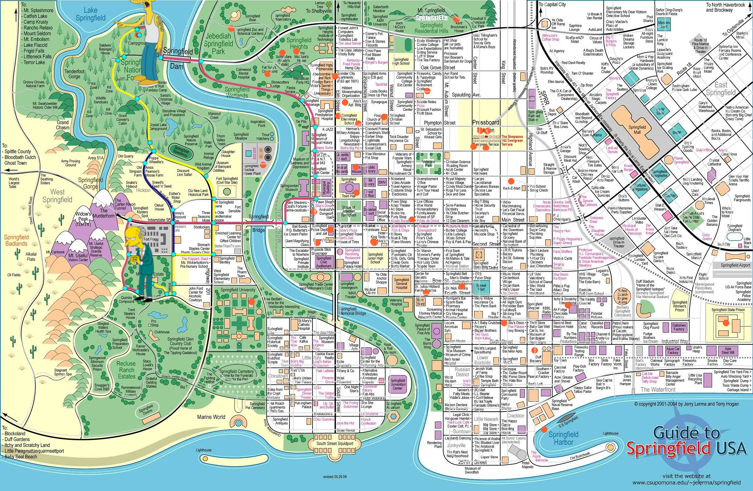
Finally, a trick or treating route around Springfield that avoids Sideshow Bob!
It gives us a pretty reasonable route around the neighbourhood. It certainly avoids Sideshow Bob. But there’s still something niggling at me. We haven’t resolved all our quirks from earlier, nor have we accounted for the time Bart will spend chatting.
Remember that weird distance discrepancy with Ned and Milhouse? Where the distance to Flanders was three times the distance to Milhouse? It’s time to solve this. And in order to do so, I managed to get the Simpsons’ hit and run into the video after all!
It’s play time….
Creating my own Empirical Evidence
Okay so I’m going to set a timer here and see how quickly I can run from Homer’s house to Ned’s house. Here we go. Three. Two. One. Alright!
Seventeen seconds! Now this is faster than a walking speed because Homer is running but come on, it’s Homer, it’s not that much faster! So with him taking 17 seconds to travel 6 distance units we can calculate our speed and create a new unit of measurement: the Springfield Unit. Let’s not look closely at what this means in practise, let’s just say it accounts for the weird distance quirks.
One final thing I can add is a time penalty for visiting a house. Bart’s well known in Springfield, famously and infamously, so he’s going to spend a lot of time chatting. So let’s add a five minute delay (equivalently five minutes worth of distance) to every visit to disincentivise him from listening to too many lectures.
With all of this in place, we’re ready to run our algorithm again. Here is the final reveal. We saw earlier our first optimisation attempt before we adjusted for speed and chats. I’m going to show you the freshly optimised path in three… two… one…
Optimal Route
It’s exactly the same. After all that advanced data science, the hours spent plotting locations, converting speeds, running complex optimisation algorithms. It turns out that Bart’s optimal trick-or-treating route is the exact same one he would have taken anyway: a simple walk around the neighbourhood, hitting all the most candy-rich houses. So my Halloween has ended with a trick.
Data Science in Real Life
So why did we do all this? It’s not just an excuse for me to play Simpsons hit and run and it’s not so we can make a tenuous link to Halloween. We did this because this exercise comes up all over the place in real life. Take shipping for example. So much oil is extracted from the Middle East but needs to go all the way to the US for refining. How does it get there?
If we used the shortest path algorithm only it would all get sent through the Suez Canal. But it doesn’t. It’s expensive to go through the Suez Canal, a massive penalty in our optimisation function, so much so that oil tankers actually go around the cape of Africa instead, increasing the distance massively but saving overall on costs.
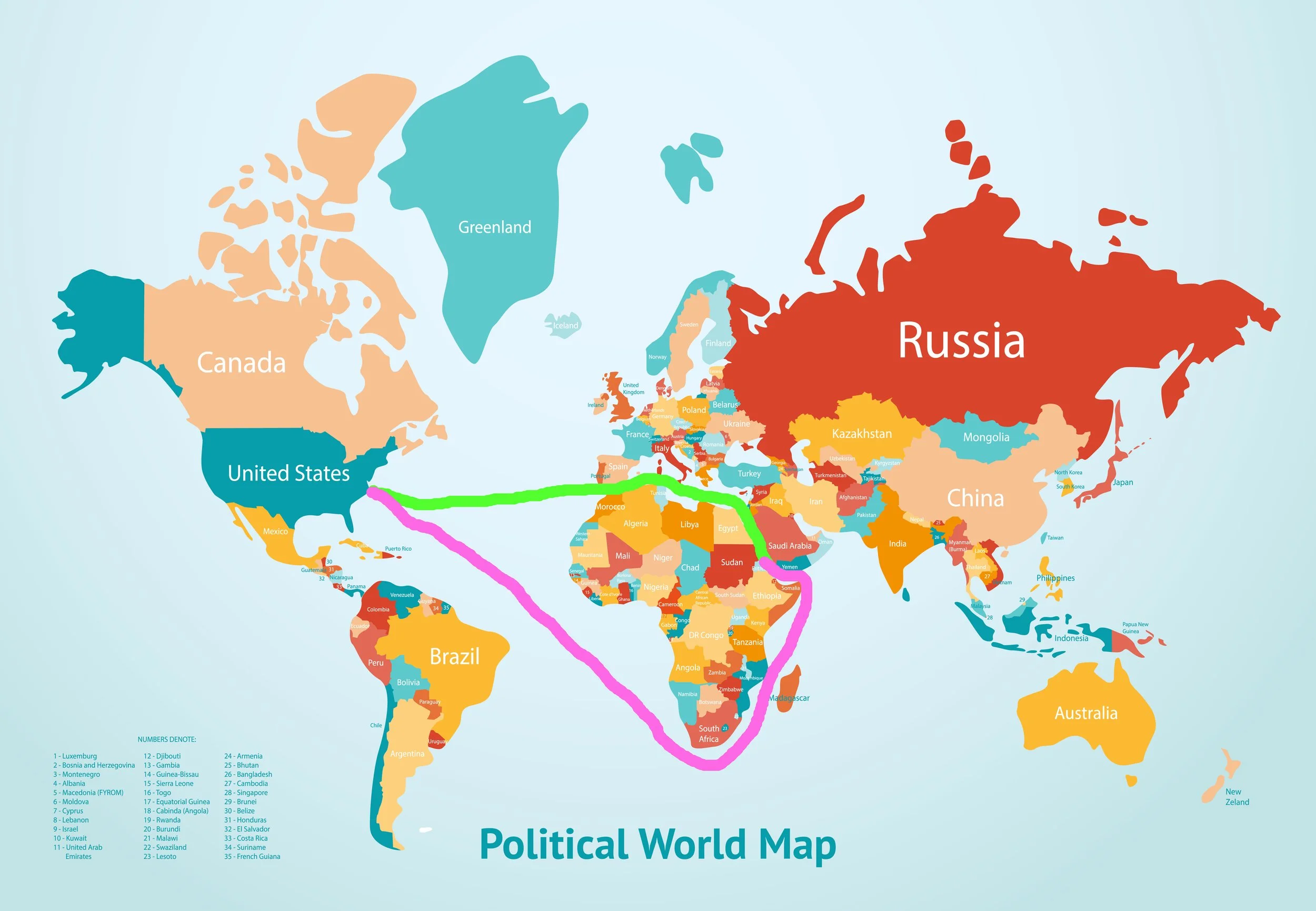
The Suez canal (green) might be faster, but in reality due to costs oil tankers to the US take the longer route (pink) around the Cape of Africa.
And this is the kind of complex problem we’re solving at Evil Works, making it easier to actually do the data science. Our visualisations make it much easier to plot than the nightmare I had creating this video so you can focus on the fun part: finding the optimal route.
But not enough of a nightmare that I wouldn’t do it again if given the map of Pawnee. If anyone’s nerd enough to make it, let me know by joining our community of data scientists: the Evil Lair.
Please like and subscribe to our YouTube channel and tell me, who do you think would give Bart the most candy?