
Using Heart Rate Data to predict the best jump scare
It's a spooky season. That gave me a terrible, wonderful idea: let’s make my colleagues watch those jumpscares scenes while we track their heartbeats. For research. And maybe for laughs. We’ve got sensors, timestamps, and a playlist designed to ruin office friendships. Let’s find out who screams first and what the data says.
Do our Hearts skip a beat with Jump scares?
We already built the perfect horror movie from jump-scare data. So I pulled a handful of films with the highest scare scores and clipped only the major moments. Which raised a question: what does your heart actually do when a jump scare lands? and is our office full of brave nerds or just very loud ones?
Scenes? Loaded. Sensors? On. Room? Pitch black. Easy data, right? Not quite. Once we synced footage and logs, some readings were inaccurate or gone. And yes, Graham, this is your moment. ‘I know how to use it,’ you said.
Okay, here’s the plan: use this data to pick the exact jump scare that will terrify my boss. But if I want accurate predictions, I need clean data, full stop. If a watch drifts or timestamps don’t line up, you’re training on ghosts.
So we kept it simple: same clock for everything and a quick calm baseline for each person. Once the inputs are honest, the features stop wobbling and the model can learn actual patterns, not our mistakes. Measure right so it can predict right.

Get comfy…. We’ve got some Jumpscare heartrates to analyse!
Under the hood…
It’s simple but strict: we load the raw CSVs, parse the timestamps into real datetimes, and snap every heartbeat stream onto one shared clock. Because not every stream has a beat every second, we allow a ±2-second nearest-match so gaps don’t break the sync. We set t = 0 at the exact moment the montage starts, then trim the timeline to the known end of the video.
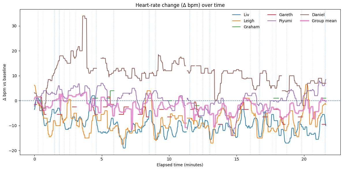
Now one thing to note is that raw heart rates aren’t comparable, my “chill” might be 95 and yours 70. So we level the field: take the first 30 seconds as your personal baseline, then track Δbpm: how many beats above calm you climb during the video.
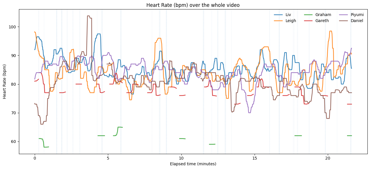
Graph to show Heart rate’s of each person throughout watching the jumpscares
If I ran this again, I’d grab a true resting baseline before we roll, because just knowing a scare reel is coming can nudge your pulse. Not Graham, apparently.
Let’s Play… Where’s Graham’s Heart Rate??
Let’s see it: a heatmap of Δbpm over time: blue = chill, red = chaos. Daniel’s not as stoic as he thinks and his heartbeat is screaming. Piyumi warms, Liv & Leigh dip then rebound. Gareth & Graham have gaps, so comparisons are shaky. Same scares, different bodies, some hit the gas, others slam the brakes. That’s the chaos.
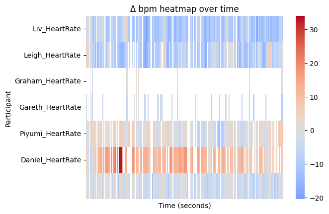
a Heatmap of Δbpm
Now let's measure those fears:
After each scare we take a 0–15 second impulse window. For every person, we average those windows to get a “startle signature.” Then we extract features: peak height, latency (how many seconds to the top), half-recovery (how fast you calm halfway), and the AUC Area Under the Curve (how much total panic you had in the first 10 seconds).
So we can create a function to turn this messy heartbeat data into a simple fear fingerprint. For each jump scare, it grabs a tiny story in time: 10 seconds before the scare to measure your calm, then 0–15 seconds after to watch the reaction.
Here’s how we judge fear:
Peak: biggest jump after the scare.
Latency: how many seconds to that peak.
Half-recovery: how fast you drop back to half the peak.
AUC(0–10s): total “panic area” in the first 10s.
Big response?: count it if the peak is ≥ 5 bpm.
Average the reactions across all scenes → your mean impulse curve (0–15s): the shape of how you spike and settle.
Now let's look at this scoreboard:
Daniel - “Train to Busan” (Afterburner)
Relentless momentum, big, sustained spikes.Piyumi - “The Ring” (Creeping Lift)
Steady rise, moderate sustain and tension keeps tightening.Liv - “The Conjuring”
Startle and brief freeze (dip) and quick recovery.Leigh - “Lights Out” (Snap Shock)
Fastest; sharp dip, reset, repeat.Gareth - “The Blair Witch Project”
Patchy footage, signal too thin to compare.Graham - “Paranormal Activity”
Long gaps and flickers, fun, but stats are shaky.
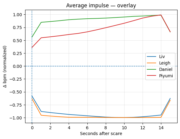
Average Impulse Overlay
Watching that overlay, something clicks:
People who sat together show the same impulse shape. Liv & Leigh dip in unison right after the scare, then rebound. Daniel & Piyumi ramp up together across the whole 15 s window. That’s not just vibes, it’s a known thing called physiological synchrony: when groups share attention or emotion, their bodies can literally line up. There’s research on audience heart-rates syncing during shared experiences, and news coverage of the effect in real audiences, too and also a study on physiological synchrony you can read on. It's a big reason group horror feels contagious.

You thinking what i’m thinking?….
Alright, Evil work time…
If watching together syncs you up, let’s use it. I wrote a function find_room(): feed it your impulse profile and it uses k-nearest neighbours using the features created previously(peak, latency) to see which room your heart desires. For the demo, I volunteered my flatmate Matt. He wasn't thrilled but hey, all in the name of science.
K-nearest neighbours is the “find your people” algorithm. We turn each viewer into a point made of their features. When a new heart comes in, we standardise the features, measure distance to everyone else (I use cosine), and grab the K closest profiles.
If most of those neighbours belong to Room A, you probably belong in Room A too. No training, it’s a memory-based vibe check. Small K = super specific (but noisy), bigger K = steadier (but blurrier). And if your best neighbour is still too far away, our confidence drops and we put you to the 1408 room.
No one lasts more than an hour inside….
Matt’s A Good Sport:
Then my (Caroline’s) flatmate Matt took one for science. Our K-NN “find_room” looked at his impulse and said he’s closest to Daniel (~0.60) and Piyumi (~0.78). But check his curve: quick spike, then he slides below baseline by ~10 seconds. He’s a natural cooler. So the recommender would seat Matt with Daniel & Piyumi, not to crank the fear, but to calm the aftershock.
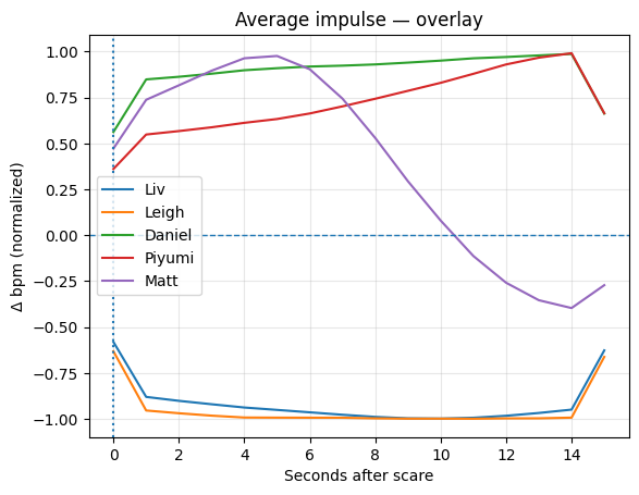
Matt = Cool, Calm and Collected
Want to know if you calm the room or join the fear? Join our Discord . We’ll post the jump-scare montage, watch with any heart-rate app, export your CSV, and drop it in #fear-lab. We’ll map your impulse, find your fear twins, and tell you your placement: …. or Cooler. Subscribe to our YouTube channel for more videos and more data science
Come on the journey with us by joining the Evil Lair.