
I Used Maths to Prove Google Trends SUCKS!
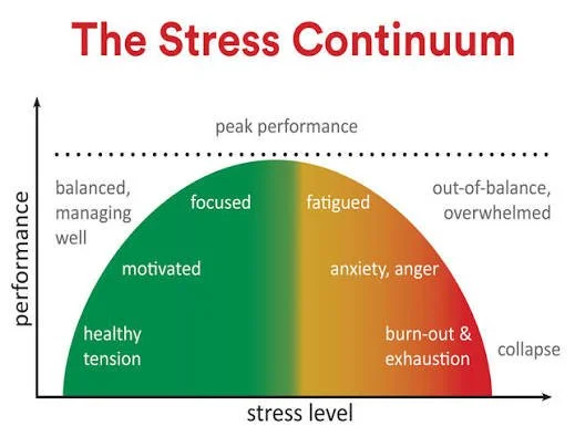
What Motivates People?
Is it passion? Purpose? A good cup of tea?
Having something to queue for? The promise of a Sunday roast? The fear of disappointing your Nan?
I asked my colleague Caroline what motivates people in Brazil. Her answer? Football. Alright, but I'm English, I've been singing "It's Coming Home" since birth. She then suggested beaches and carnivals. That's the differentiating factor I'm looking for. We don't have the weather for those.
It's not all cultural stereotypes. I made a cup of tea for a prop for the video which I don't drink and SHE does. (Don't let the King find out, or we're both in trouble). So if what motivates people depends a lot on where you're from. There's something interesting there. Maybe this basket will help?
Where There’s A Will There’s A Way…
So I came up with this amazing idea recently to help me on the days that I’m feeling unmotivated. Because often it’s been a long work day writing pithy YouTube video scripts and I’ve come home and need to put away the laundry or follow up on that incorrect entry on my credit report and I’ve just got nothing. I sit down on the sofa and open up a video essay on fascism in Star Wars Andar and the next thing I know it’s time for bed and I’ve got no socks to wear tomorrow.
So I came up with a plan, a new way to inject myself with the boost of energy needed to become a tidying my desk machine. It looks like this: Open my laptop, load Left 4 Dead 2, skip straight to The Sacrifice finale (on advanced, I’m not a masochist) and feel the sheer adrenalin of avoiding those three tanks.

If I see one more puke zombie, I’m gonna puke on you
Fight Or Flight Response
Then when my body is in straight up stress mode, that’s when I can get on with the chores and admin tasks. Unbeatable plan for getting things done.
Do I sound slightly unhinged? Probably. But this isn’t just about my peculiar habits.
I’ve been on a mission to understand motivation and what factors lead to it and instead of relying on scientific techniques and previous literature in the area, I’m doing it with google trends.
But google trends data has some, a lot, of pitfalls and I made a whole presentation for my team called “Why Google Trends Data Is A Pain In The Rear And What To Do About It” just so I could rant at them for half an hour.
I gave you a taster of that in our last video on this topic, introducing you to the concept of chaining data across overlapping windows to get around the granularity limitations of google trends data and I finished that one with a promise: That in this video, I would tell you, a millennial, gen Z or really overly ambitious gen alpha, why you should care about Facebook.
Turn pressure into performance
Picking Up Where We Left Off.
I’ve gone and downloaded the data on motivation for five years and scaled it so we have one big dataset of motivation searches for each country that gives us a rough idea of how each country’s interest in motivation changes over time. But I still have a problem. I don’t know whether a google trends score of 100 searches in the US is bigger or smaller than a score of 100 in the UK, and my first suggestion for how to work that out fell flat. Let me explain.
So when I started this project I wasn’t a connoisseur of Google Trends and I quite naively tried typing in UK motivation, then adding a comparison and typing it motivation again and changing the location to the US then being confused as to why it’s the same graph. So then I thought it was just that UK and US were too similar so I added Japan and it wasn’t until I got to China that I realised that the graph was changing all of the lines to be that country’s motivation. Some days my eye for detail just isn’t there.
So if I can’t get the countries on the same graph then I can’t compare them. Unless I find a more creative way…
My next brainwave came from looking at the US, because if you scroll down on google trends you’ll see that there’s this subregion section showing the states in the US in relative terms. So the state with the highest search volume is set to 100 and the other states are scaled accordingly. So I thought I was a genius, I’ll just set the region to be worldwide, see the different numbers that come out for my countries of interest and just multiply the results for that country by that number.
But it turns out, I had misunderstood something fundamental again. And I’m sorry but we’re going to need to do some maths to explain it.
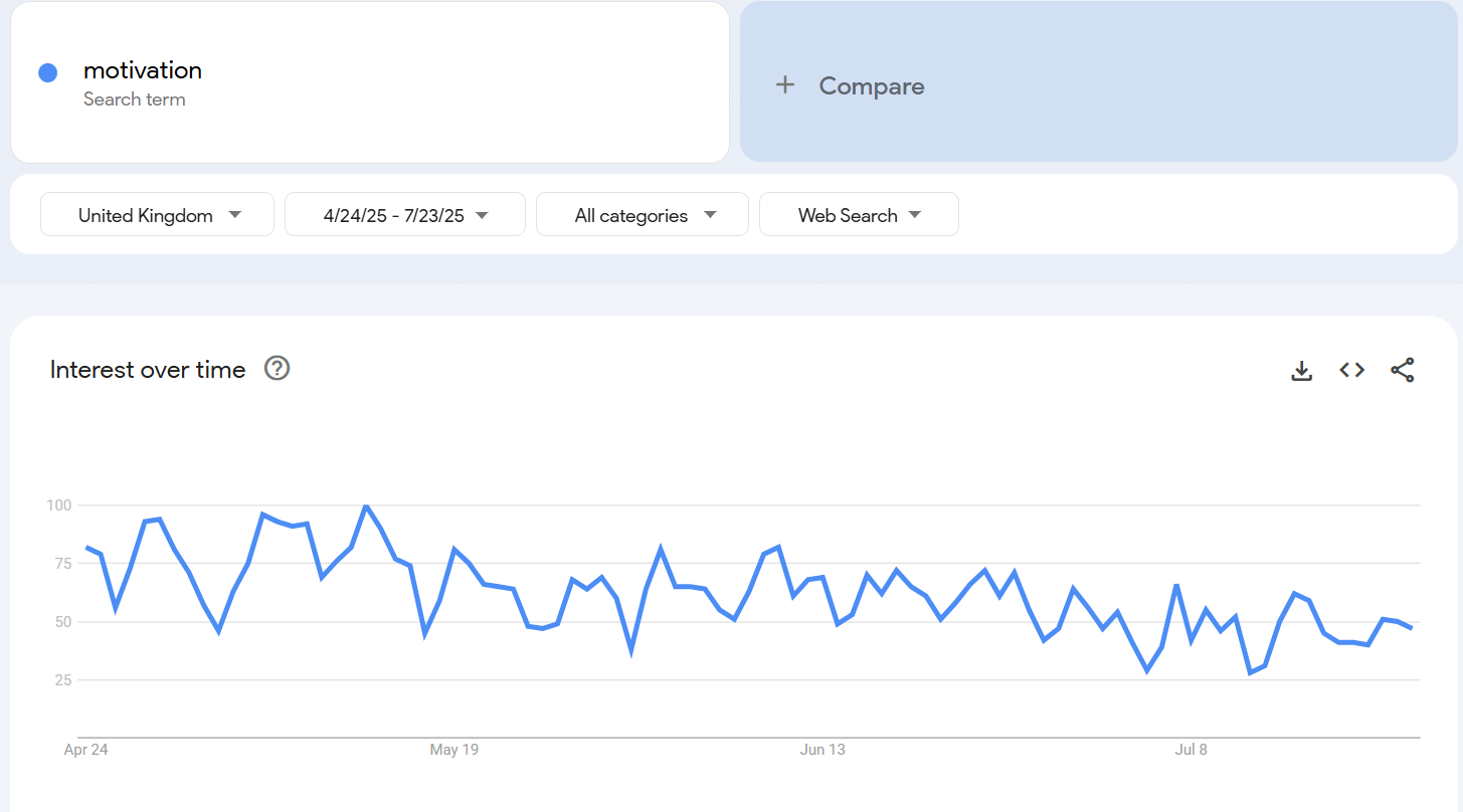
When 100 means something different on each side of the Atlantic.
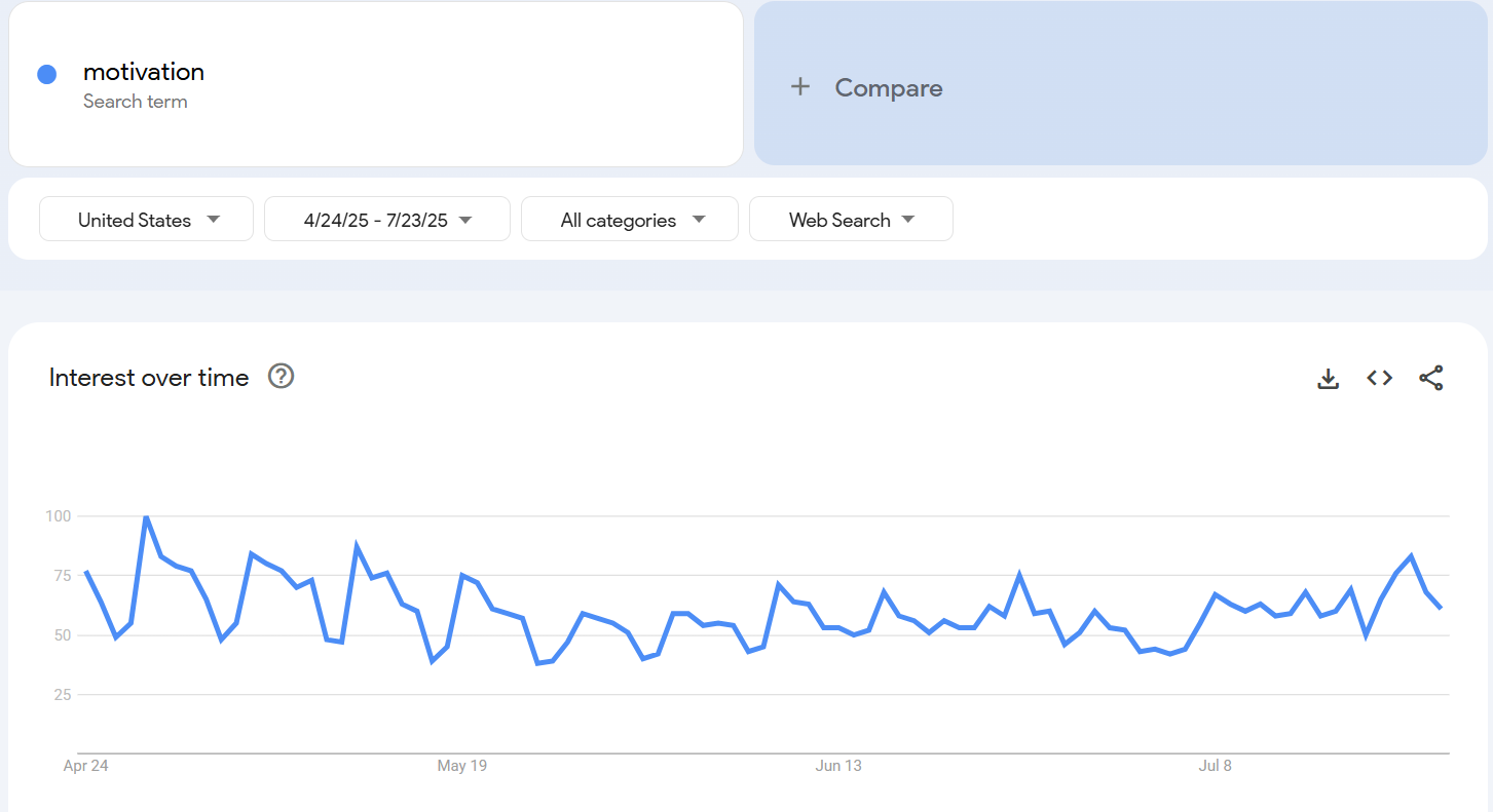
Graph of US and UK showing interest over time searching for motivation over 90 days
What Comes Next…..
So I grabbed ninety days of data from the US and the UK from the 24th of April on two separate google trends graphs as you can see here. They’re both scaled so the maximum is at 100 which occurs on a different day for each country.
The problem is that because we’re looking at two different countries, the google trends scores are in fundamentally different units for each country. Just like inches and centimetres are different units of measurement, so are US Google Trends units and UK Google trends Units units. And unlike inches to centimetres, we don’t know the conversion factor here.
Let’s assume that on the worldwide graph the US is given a score of 100 and the UK is given a score of 50. The UK score of 50 means that the peak of UK is 50% of the peak of the US. On a first look this might suggest that the conversion factor between these two units is a half, ie UK units are half the US units or equivalently one US unit is 2 UK units. I’m now going to convince you why this isn’t true.
Let’s take this to a day that’s not a peak day. Let’s look at the 30th April and say hypothetically that its score was 70 in the US and 80 in the UK. This means that the score in the US that day was 70% of its peak and the score in the UK that day was 80% of its peak. Let’s look at it with some maths:
70% of US peak = 70% * 100 US units = 70% * 2 * 100 UK units (based on the scaling factor earlier) = 140 UK units
And
80% of UK peak = 80% * 100 UK units = 80 UK units
And last time I checked, 140 was not double 80.
Just because the peak of US is twice the peak of UK doesn’t mean that for the whole time period the US data is twice the UK data!
So okay, we can’t just take the worldwide ratios to compare the data of different countries. So what can we do? Well that’s why I have this Basket
The thing I love the most about data science is that the underlying science and methodologies we use can translate across multiple different domains. A few weeks ago, I used an algorithm invented for computer science to optimise Bart Simpson’s Trick or Treating route for Halloween, and for this problem I’m going to take a similar approach.
Because I learned my data scientist skills before I even knew what a data scientist was, forged in the chaos that is the trading floor of an investment bank. If you’ve ever heard of the term “Exchange Traded Fund” then that might give you a little bit of an idea of what you’re in for, but if not do not fear.
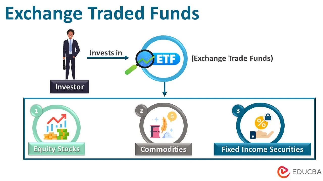
Steps On Exchange Traded Funds
Next Week….
I’m going to be breaking down how a financial product created in 1989 can be used to solve this real world problem: How do we make google trends data comparable across countries? This solution is transferable to marketing, entrepreneurship, academia and general curiosity in the way the human mind works.
So if you’re finding this data science deep dive helpful, subscribe to our youtube channel so you don’t miss the next part. We’re all about breaking down complex data science topics with real world examples that gives you the tools to do the same.
Speaking of which: Do you have any real world problems that our magic might help you solve? Or any pop culture challenges you think we should turn our hand to? Let us know on our discord
Oh and one more thing for today: Data science is always more fun if you let yourself be a little Evil.
Come on the journey with us by joining the Evil Lair.