
Live Data Science Walkthrough: Making Google Trends Data Usable
The Hidden Problem with Google Trends Data
Have you ever tried using Google Trends for market research or machine learning?
You jump into Google Trends, type something like YouTube, and think:
“Wow this is incredibly granular. I can get data every 15–16 minutes. This is perfect for machine learning.”
So you download a month of data…..And suddenly… it’s daily.
Not ideal, but still workable.
Then you try a year.
Now everything is aggregated weekly.
Instead of 365 daily data points, you’ve got 52. That’s nowhere near enough for most time series models.
So how do we turn Google Trends data into something granular enough for machine learning?
That’s what this post is about.
Why You Can’t Just Stitch 90 Day Windows Together
You might think:
“Easy. I’ll just pull the maximum daily window (90 days), slide it forward, and stitch the results together.”
Seems reasonable, right?
But here’s the problem, and I’ve used Facebook as our example
Google normalises each query window independently.
For every request:
The highest value in that window is set to 100
Everything else is scaled relative to that
So if you naively stitch multiple 90 day windows together, you get something that looks like this:

Graph of raw google trends output for Facebook
Normal search behaviour
Then suddenly the entire world stops searching…
Except for one day?
Then back to normal.
Obviously, the world didn’t coordinate a global “don’t search” event.
What actually happened is this:
A single day within one 90 day window had a relatively higher spike (Facebook had gone down on this particular day and this is why).
That day was set to 100.
Everything else in that window was scaled down.
When stitched to adjacent windows, the scales don’t match.
So we need a smarter approach.
The Fix: Rolling Windows With Overlap
Instead of stitching independent windows, we:
Pull 90 day windows
Move forward 60 days each time
Create a 30 day overlap
Use the overlap to calculate a scaling factor
This allows us to normalise each new batch against the previous one and eventually normalise everything back to the first batch. lets explain how this works
Step 1: Pulling the Data
We use PyTrends, an unofficial API for Google Trends.
It works well ….. but you will hit rate limits.
So the setup includes:
pytrends
datetime
time (for sleep delays)
A dataframe library (I used Polars; Pandas works fine)
matplotlib.pyplot for plotting
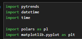
Imports required
We build a TrendReq, define a payload with:
Search term (e.g., Facebook)
Time range
Geography (e.g., GB)
Then call .interest_over_time().
Simple… until rate limiting kicks in.
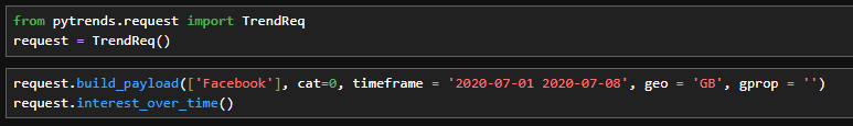
Basic pytrends request
Handling Rate Limits (The Real Data Science Experience)
To deal with rate limits:
Wrap the call in
try/catchLog failures
Sleep for 60 seconds
Retry (multiple times)
Eventually, you’ll get your window.
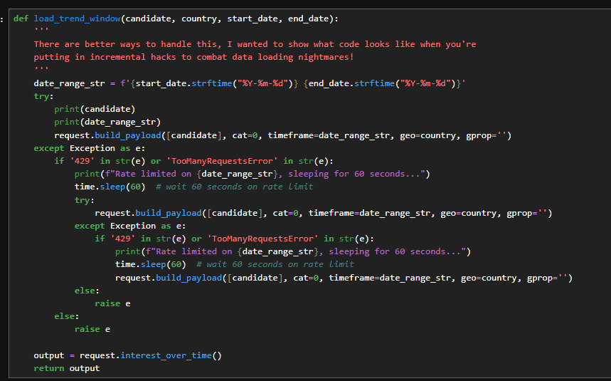
Function for Rate limits
Then I wrapped everything in another function that:
Converts Pandas to Polars
Adds a batch number
Saves intermediate results
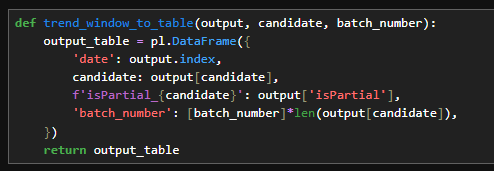
Function to convert to polars and added batch numbers
Why?
Because when rate limiting killed the script halfway through, I lost everything.
So I split the job into:
Part 1
Part 2
Part 3
Each saves to CSV.
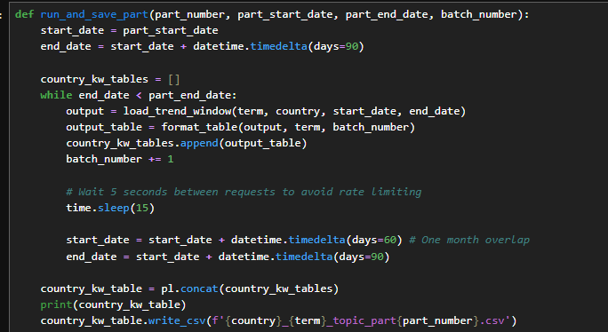
Function for running and saving
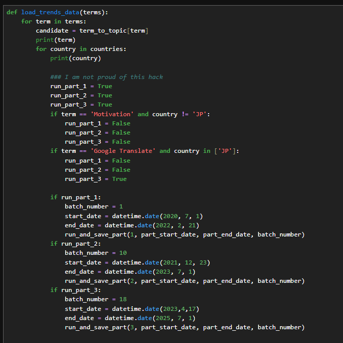
Control for re-running parts
Is this beautiful production code?
No.
Is this what real world data science often looks like?
Yes.
You optimise modelling code.
Data collection code? Often hacked together until it works.
Step 2: Combining the Batches
Now we:
Load all partial CSVs
Merge them
Restore date formats
Fix floats and integers
Combine terms (YouTube, Amazon, Facebook, etc.) into one table
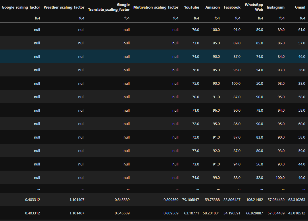
At this stage, the data still looks broken because we haven’t normalised the rolling windows.
Now comes the important part.
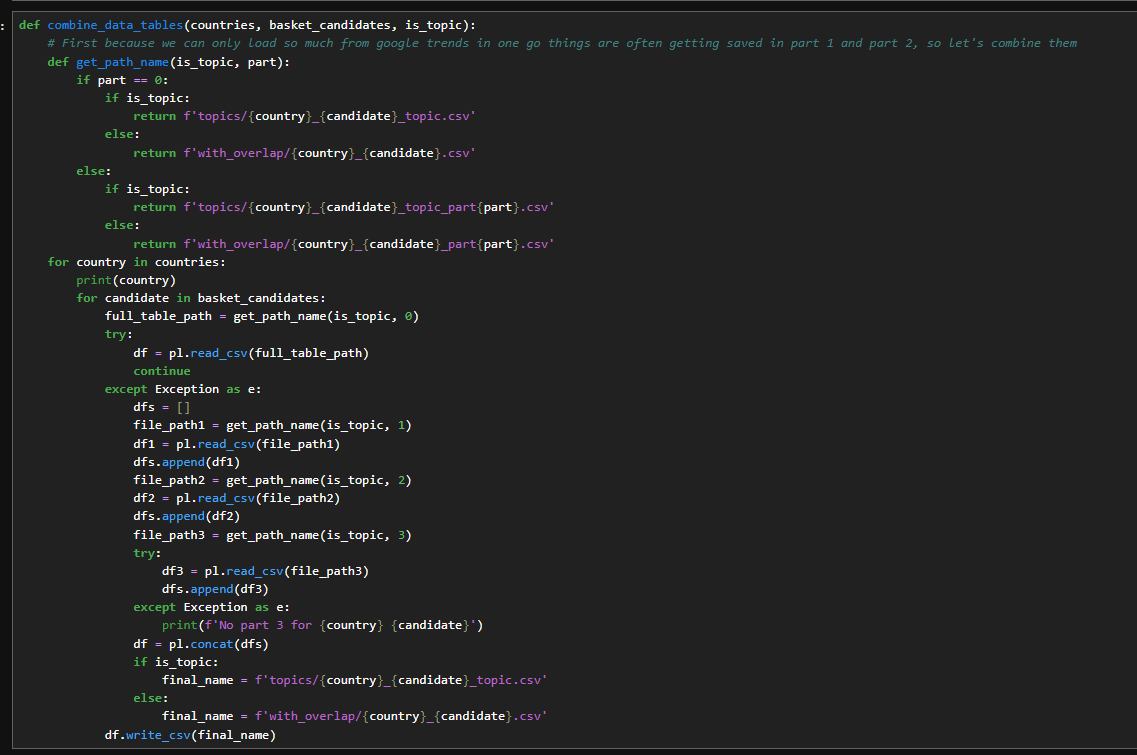
Function to combine
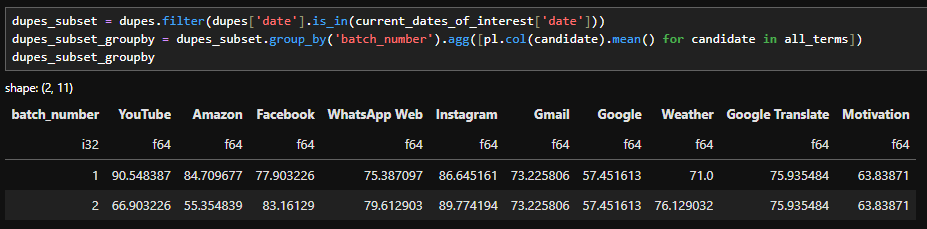
So, examining the output of this function, we see… Here are the Google Trends values for each of the specified dates across the different terms. As I mentioned, if we focus on the Facebook graph, its current pattern looks like this
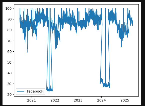
Graph of raw google trends output for Facebook
We've not done any processing to join up with that moving window so it's in the same world. So lets explain that now
Step 3: Finding the Overlapping Dates
We:
Add a column called
count = 1Group by date
Sum the count
This tells us how many times each date appears.
Dates appearing once - not overlapping
Dates appearing twice - overlapping windows
We only care about the duplicates. In my code i’m calling that dupe_dates
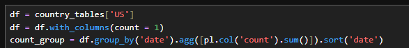
Adding and grouping by count
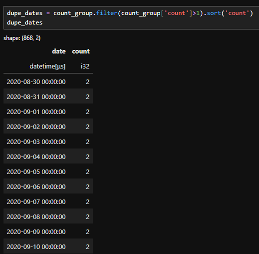
Filtering to just duplicate dates
When I analyse time based data I’m not interested in isolated dates that appear only once. Those single occurrences don’t help calculate overlapping windows, instead we:
Remove everything that appears once .
Keep the dates that are overlapping
Filter all the data on dates that contribute to overlapping windows.
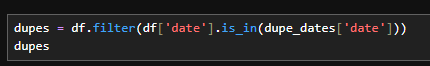
Filtering the raw data to only the dates that appear twice
Step 4 : calculating the scaling factor between batches
To do this, I perform another group_by on the filtered table.
This allows me to collect the batch numbers associated with each remaining date.
Because of how the data was originally constructed, I already know two important things:
Each overlapping date appears in exactly two batches.
Those batches are already in chronological order.
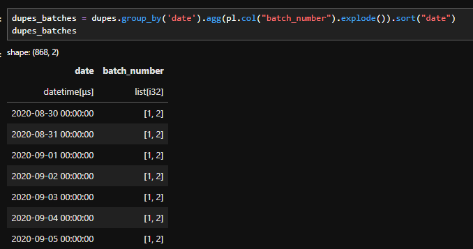
Code to identify which batches each date is part of
This allows me to filter down to the dates that I want. So if I'm working on the scaling factor between batch i and j, I can filter down to the relevant dates like this:

Code to filter down the dates for the relevant batch
Now you might be thinking…
"Why are you doing this complicated explode and filter logic?, Why not just use something simple like this?":

Simple filtering to batch i and j
And the answer is because we want dates that are only in the window between batches 1 and 2. If we filter with an OR we'll grab dates that are in batch 2 but not in batch 1, namely the ones in the window between batches 2 and 3.
So if we use the correct filter, we can grab only the dates we want, and do a group_by with a mean to get the average of the window dates from the batch 1 dataset, and the average of the window dates from the batch 2 dataset.
filtering and grouping by to get the average of the window in each batch
Dividing between the two and correcting the batch_number column allows us to calculate the scaling factor between the batches
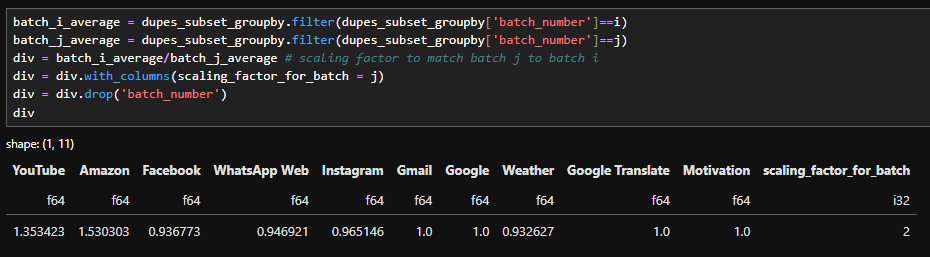
Calculating the scaling factor between batch 1 and 2
I packaged all of that logic into a single function. Inside it, I loop through each element we discussed and build one consolidated scaling factor table.
If you’ve been working in data science for a while, you might be wondering:
“Why not just vectorise this?”
That’s a fair question.
The short answer is: clarity.
For the purpose of teaching and walking through the logic step by step (especially in a video format), writing it out explicitly makes the transformation easier to follow. You can see exactly how each piece contributes to the final result.
That said, this implementation can absolutely be vectorised. In fact, I’d encourage you to try. Refactoring this into a vectorised approach is a great exercise if you’re looking to level up your programming skills.
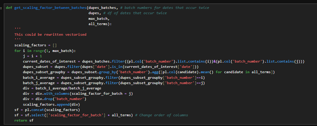
Function for calculating the scaling factor between batches
Above, the scaling factor table looks something like this,
for each batch, we calculate a scaling factor that normalises it to the previous batch.
For example, the scaling factor in row four tells us how to adjust Batch 4 so it matches the scale of Batch 3.
However that’s not what I ultimately want.
Instead of chaining each batch to the previous one, I want every batch normalised to Batch 1.
To get the scaling factor between Batch 3 and Batch 1, I simply multiply:
The factor from Batch 3 - Batch 2
By the factor from Batch 2- Batch 1
This gives us one combined scaling factor that puts every batch on the same scale
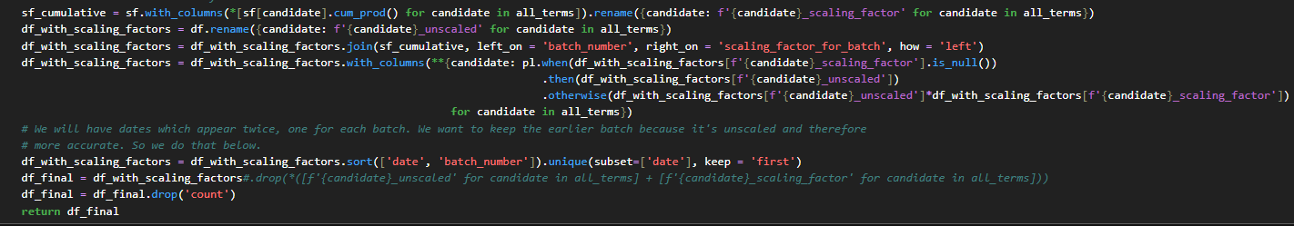
Using a cumprod to calculate the scaling factors with batch 1 and finishing our data cleaning step
The data then looks like this below. You can see that the scaling factors are null for batch 1 to batch 1 but kick in for batch 2 onwards.
Data after scaling has been applied.
Step 5 : Examining the results
On this graph below, we can see the original data alongside the scaled data. The orange line shows the small drop offs:
“The odd spikes that look like, well, the world suddenly stopped Googling”
In contrast, the scaled data forms a much smoother, continuous line.
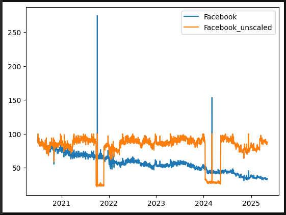
Graph of the unscaled data versus our scaled data
I’m going to take that line in the graph as it is and examine it for a moment, then compare it with Google Trends data over the same five year period. At first glance, they look quite similar the peaks occur at the same times. I double checked the dates, and the peaks do align.
However, you might notice that the scale is different:
The peak in our data is much higher than the peak in the Google Trends data.
At first glance, this might make it seem like our scaling factors exaggerated that particular peak, which could raise concerns about the accuracy of the data.
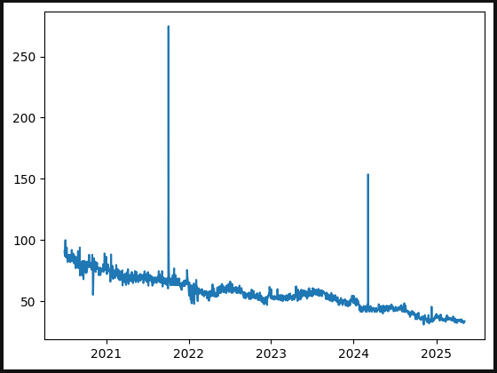
Scaled Facebook data
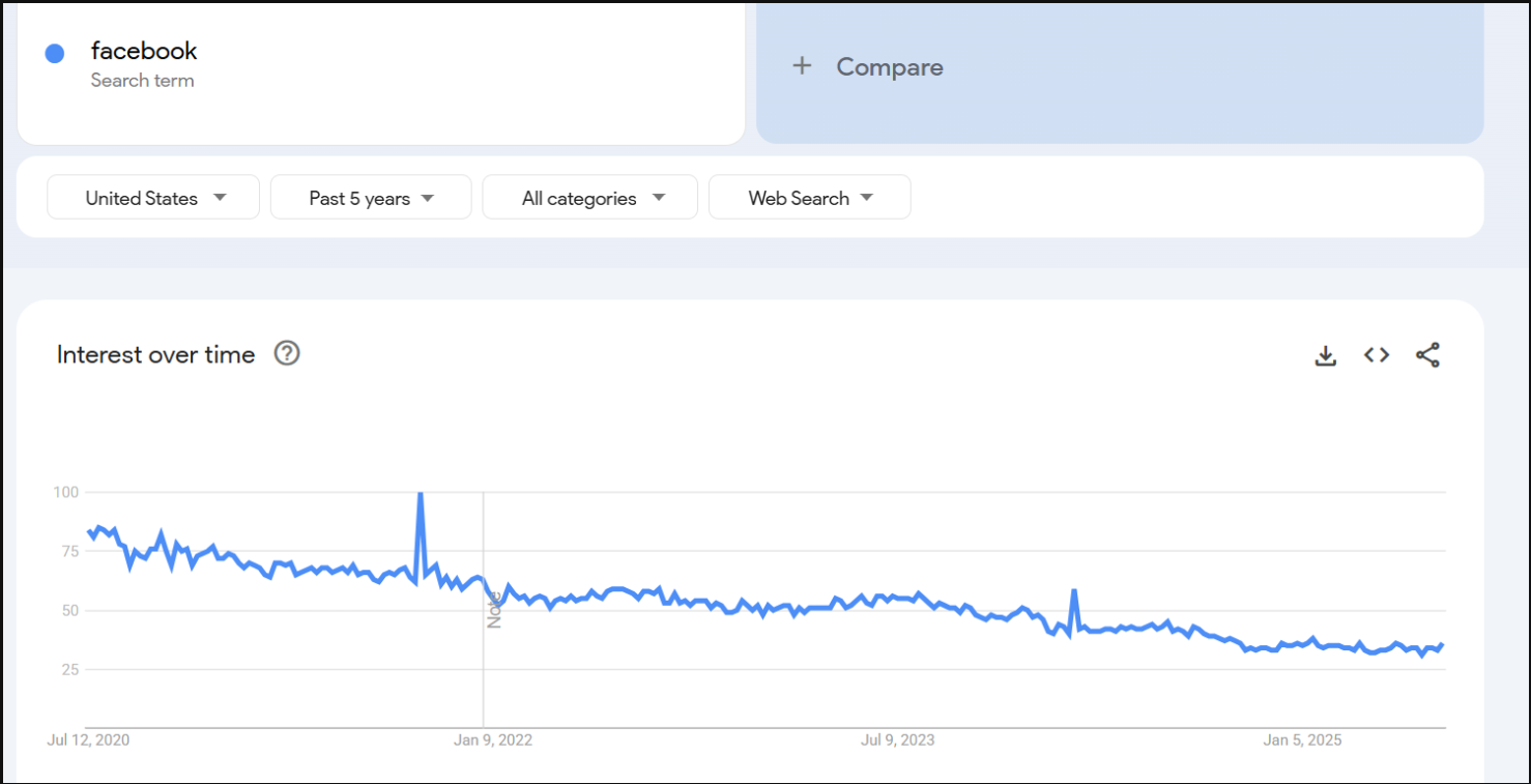
Google trends facebook data
Remember….
that Google Trends averages data on a weekly basis.
If I take the weekly data for this time period and calculate the average, a value around 100 would indicate that my data is in the right ballpark.
I did that calculation for this specific date and got 102.8, which shows that our data not only behaves like Google Trends data but also gives us daily values that can be used directly in models.
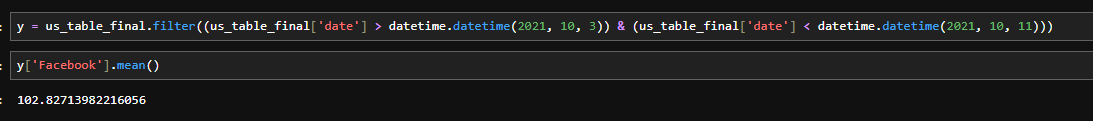
Our average over this date is reasonable
This is how we transformed Google Trends data into a format suitable for machine learning. The code is available on GitHub, so why not click the link and try it out yourself.
For more of this, come on the journey with us and keep being Evil