
I Stole a Wall Street Trick for Data Science
Why Google Trends Fails at Country Comparisons (& How I Fixed It)
Ever wondered why comparing Google Trends across countries feels impossible? I stumbled across this problem when I wanted to use google trends data to understand what it is that drives people.
I thought it’d be an interesting video on multilinear regression, that I’d grab the google trends data for motivation and some other clever terms and off we go, but boy was I wrong.
Because last week we found out that it’s impossible to compare different countries to each other using the google trends API. But today, we’ve had a burst of inspiration. We’re going to borrow an idea from something created in the world of finance to solve this very problem. So it’s off I go to the stock market. Good job I brought a basket with me.

No wonder finance invented data science to make this process a whole lot easier. I'm going to talk about how one data science concept can be used to understand the secret to human motivation.
Time to Take Our Basket to the Stock Market
One of the beauties of data science is that the underlying science and methodologies we use can translate to a variety of different domains so to understand how to do this, we’re going to take my basket on a detour to the world of finance, and more specifically the stock market.
So the stock market, as you’re probably aware, is a place for buying and selling equity, or shares in a company. These shares are a partial ownership and usually come with things like voting rights or the ability to receive dividends, like a small bonus for being an owner of the company. Stocks can be held by individuals like you and I or big investors like banks and hedge funds or other private companies.
The stock market can be used as a measure of the economic health of a country. When stocks are going up, we’re in a bull market and the country is, in theory, financially prosperous. When the market starts to fall we enter a bear market and things are going less well. This is a huge simplification, the markets move according to human behaviour which is a notoriously difficult thing to understand, but for our purposes this generalisation holds - we can gain an understanding of a country’s economic health based on its stock market.
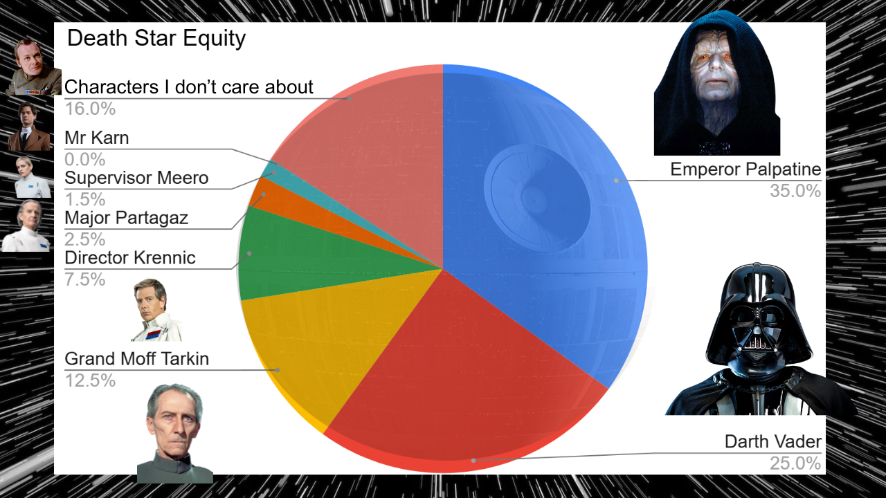
Who Owns Shares in the Death Star?
Tracking the Market Through Indices
So how do we track the stock market as a whole? Well the obvious thing to do is to take all the shares on the stock exchange, multiply them by their price and add them all up to get an overall number for the value of the stock market. But this isn’t how it works in reality. In reality, we use indices.
You’ve probably heard of the S&P 500, an index built up of the 500 biggest companies in the US. It’s used to track the US market because, being the biggest companies, it covers about 80% of the total market capitalisation, that’s value effectively, and are also very liquid, that means they’re easily traded and their prices move a lot.
Because they cover the majority of the market, it’s a good representation of the whole market in a smaller collection of 500 stocks. Why 500? Well, for starters the S&P 500 was introduced in 1957 and I was going to say that the computational power available to calculate the market capitalisation of thousands of stocks wasn’t there like it is today but it’s even more interesting than that because the S&P 500 was only created with 500 stocks because of a new electronic calculation method that enabled 500 stocks to be included in the calculation. Before that, indices were even smaller because they were calculated by hand!

Charging Bull, In the financial District of New York, The Symbol of financial prosperity and optimism
Estimating Search Volumes Like a Pro
Now we do have the computation power to calculate the entire market if we want, a few thousand stocks is small fry in today’s big data world, but it’s not really necessary. Adding in smaller companies means an increase in overhead in tracking them all and also some of them might not get traded very often, meaning the information about them goes stale. The pros of adding them are outweighed by the cons.
And this conversation pops up all over finance. The UK has the FTSE-100, a basket of 100 stocks. Commodity baskets can be used to track the health of specific industries such as oil or agriculture. And inflation, measured by CPI, is made up of a basket of goods to track price changes over time.
So if a basket of representative items can be used to measure the entire stock market, or inflation, why not use it to track search volumes?
So if I want to use this concept, what I really need is some idea of the most commonly searched terms that I can use to build a S&P-500-esque index for each country, but actually that was a little optimistic because I couldn’t get a consistent source that covered lots of countries, but what I did find was a source that covered both US individually and worldwide searches and even gave an average monthly search volume for them.
So this is great. I can use this. I can pull the data for the most commonly searched terms using my chaining methodology from last time and scale my units for those terms to match the actual average search volumes to get an estimate of the actual search volume of each term. However, we still have a couple more problems to solve and one of them is that motivation isn’t one of the most popular search terms, meaning we don’t have a benchmark for it.
The way we get around this is to average the scaling factors for a subset of my basket (or the whole basket) and have this as an average US google trends units to real world search volumes. And I can then use this number to get an idea of the absolute search volumes for motivation.

Lets Go Data Shopping!
Making Search Data Truly Comparable Across Countries
Now there are a couple of caveats here. I don’t know how representative my basket is. In reality, I got temporarily banned so many times from google trends that it took me so long to get the data I needed that I only built a basket of nine items. In addition, some countries will have very large search volumes for particular terms that are completely absent from my basket. For example, I have Facebook and Instagram in my basket which are very popular in places like the UK, US et cetera. But in China, the equivalent would be WeChat which isn’t used very much outside of the country.
I wouldn’t put WeChat in my basket, because it’s not representative of the vast majority of countries around the world. But it is highly representative of China.
The other problem I have to solve is that while I know how to benchmark the US to actual google searches, how do I scale the other countries which I don’t have a benchmark for?
In order to tackle this problem I had a think about things that might influence the search volumes of a country. An obvious one is the population of the country. The US has five times as many people as the UK so it wouldn’t be surprising if the US had five times the search volume of the UK. But actually I think we can do better.
Because internet access is not uniform across the population. There are still many places in the world where people find themselves without internet access. There are older people who grew up without technology and have no interest in learning, toddlers who haven’t yet been given a tablet or people who just for whatever reason decide to opt out. The demographics of these non-internet users will be very country dependent, and so a more accurate figure could be the percentage of internet users in each country.
I actually managed to find this data and combining that with population we can get a figure for the absolute number of internet users in each country. By taking the ratio of internet users in the country and the US, we can calculate an adjustment factor for the US scaling factor for each country to leave us with a method to calculate the absolute search volume of any term for any country.
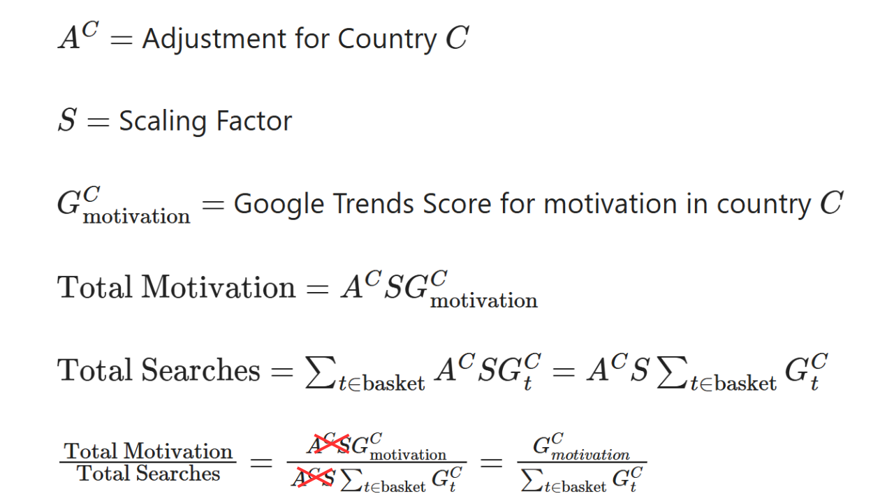
Adjusting for reality: accounting for differences in internet access when estimating search volumes across countries.
All That Work… and It Cancels Out!
Now with that in mind, I do have one more caveat. Because in order to compare countries and model motivation trends, what we’re modelling isn’t absolute search volumes for motivation. If we were then we’d conclude the US is less motivated than the UK because it searches for motivation more, but in reality we know that they’re not necessarily less motivated, there’s just more of them.
So to solve this problem I’d need to look at search volumes of motivation as a proportion of total search volume and we’ve already built something to model this: our basket of terms. So I can calculate absolute search volume for all of these terms, add them up for the basket and divide absolute motivation by absolute basket.
You might have noticed something here. If I do that, won't all my scaling factors cancel out? And actually the answer is yes. All of these scaling factors cancel out rendering the work we’ve done before unnecessary, from a certain point of view. But actually, it’s not unnecessary. Because if I’d started this part of the video saying “let’s just add up the google trends score of the basket and divide motivation by it” you probably would have thought “why? Is that something we can actually do?”. Until we did this analysis, we didn’t know we could.
There’s also an extra benefit of this. I was aware that by the time we’ve chained all the data and scaled all the numbers we’ve actually accumulated a lot of estimations and as a result a lot of noise that would pollute our numbers. By cancelling out our scale factors, we’re actually removing a lot of that noise.
So yes, we did work that is unnecessary to the final calculation. But we did it because it enabled us to understand the problem and have confidence that what we’ve actually come up with is robust. And that makes it worthwhile.
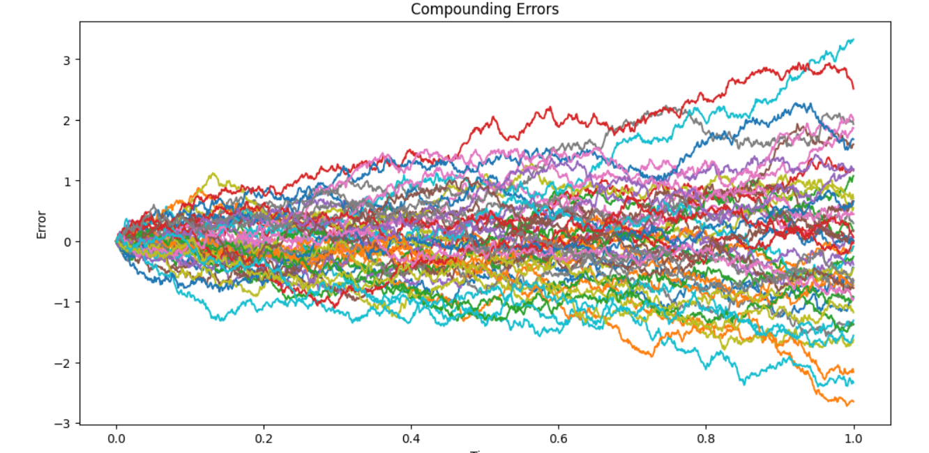
Compounding Errors in Action
So, where are we at now?
We have built a scientifically sound model that allows us to compare motivation across multiple countries over a five-year period. But all that hard work was just the setup. Now it’s time for the fun part: drawing insights.
Which country is the most motivated? Do people work harder knowing their previous hard work has given their shareholders a bonus? How much of a problem are the winter blues? We’ll be diving deep into these questions and more in the next video in this series.
Do you have any interesting data science topics you think we should explore? you can add your Evil ideas to our discord. Otherwise, check out our YouTube videos, hit that like and subscribe button so you don’t miss the next one, and keep being Evil.