
The Magic of Data Science: How I Turned Art Into Real Data
As data scientists, people think we’re magicians. When they have a problem to solve, they’ll just bring it to us and we’ll wave our magic wand and suddenly they’ll have the perfect model for what they need. Oh, what’s that? You need data to be able to do that? Wave that magic wand again and I’m sure it’ll appear.
Let’s talk about the sheer ingenuity and resourcefulness us data scientists have.
A few weeks ago, we put out a video where I used data science to plan Bart’s perfect trick or treating route for Halloween and, like for all our videos, I showed it to the team before we released it.
I knew the map had been a tun of work because I’d smashed my head against it for tens of hours, but it wasn’t until the team asked me how I did it that I realised just how valuable what I had was. Because when I walked them through the process it surprised me that their response was just “wow”.
And it made me realise just how much work we do behind the scenes to find creative solutions that appear to others like magic. And so I wanted to dedicate a video to this exact topic.
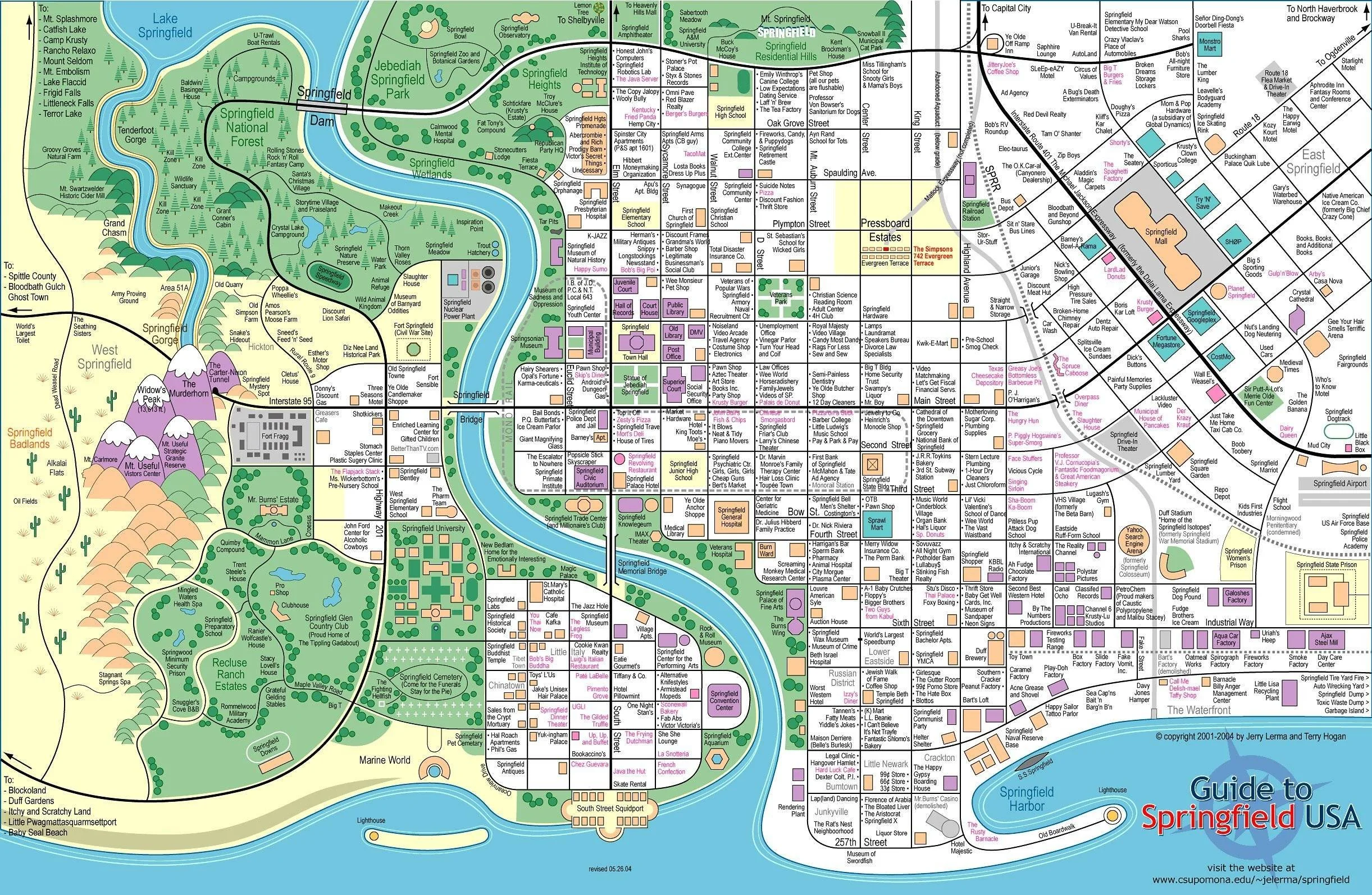
Because like all of our videos, we talk about data science topics with real-world context. Because, yes, I farted around for days turning a map of Springfield I found on reddit into something I could put into a YouTube video, but there are people actually doing real things with this kind of problem, and maybe some of you watching are actually doing this for proper jobs.
So I wanted to frame this with a real world context: Town planning, and the complete lack of usable data that often goes with it.
The Art and Science of Choosing the Perfect Spot!
Think of it this way. Suppose you’re looking to open a new school in a town. The population has grown, class sizes are too big. We need somewhere to put the kiddos to keep the youths off the street. How do you work out where to locate it? Obviously you need to know about suitable vacant buildings or empty lots. But there’s much more that goes into it than that.
Local demographics for one thing are important. No point building over the east side of town when families are moving west. Similarly local transport links are important. It’s much easier to use an already existing local train or bus station than it is to build a new one.
The same logic is used for example for companies looking for the perfect location to open their new store. There’s a whole wealth of information you can use to make strategic and informed decisions but it relies on one thing: being able to interpret your data geospatially.
And that’s where many of these projects fall apart. It’s one thing coming up with interesting features to optimise on or a next level algorithm with advanced data science techniques. But many such attempts are thwarted early with very basic models implemented for one reason: It’s really hard to get computer interpretable data on the make up of towns.
So today we’re going to go through two methods of doing this. Firstly, the ideal world where we have actual usable data to work with and can make this happen in the most straightforward way, so that you know what data to look for and can celebrate when you luck out. And then the reality that many of us actually face.
Using Springfield as a case study for smart location decisions
Understanding Shapefiles and Polygons
So the holy grail of dealing with geospatial data, that’s real world map data in lay terms, is if you end up with something called a shape file. It basically does what it says on the tin, it’s a way of storing information about the shape of a particular geospatial element in a way that relates to the real world.
The data itself is stored in things called polygons. These lay out the perimeter of the shape. Lat/long coordinate pairings that establish the boundary of what we’re looking at. And it also doesn’t need to be the case that we’re looking at just one thing. A university is usually made up of multiple buildings, so we can use multipolygons instead, a collection of polygons for each building. We also have the ability to cut holes out of polygons so that you can get that school quad you’ve always wanted.
Doing Cool Things with Polygons
For example, here’s a polygon of the state of Texas. Pretty recognisable, right? I also have a polygon of the shape of Houston right here. Now my geography is good enough that I know that Houston is a city in Texas, but if you didn’t? You can just check that the Houston polygon is contained in the Texas polygon to do this mathematically. For one example, you’d probably just google it, but if you’re looking at hundreds and thousands of locations? You’d get pretty bored pretty fast.
Another thing we can do is calculate distances. If we had demographics across town and had identified the areas with a high density of children, we could use geospatial maths to position the school so it’s at an optimal distance from the areas swarming with kids.
PUFF: Our Vision for Smarter Data Workflows
What you see on my in the images above, the visualisations I’m showing you. They’re actually part of an early prototype of our PUFF platform. You see, at Evil Works we’re not just making fun data science videos, we actually have bigger ambitions and part of that is building up a platform designed by data scientists for data scientists to make our jobs actually a whole lot easier. I mean how much easier is it to actually be able to scroll through these visualisations and see that I’ve got the states right than to individually plot each one just to cross check.
Our PUFF platform is under active development right now but if you’d like to know more about it, you can click on the link here that will take you to our website.
And having this functionality right here? If I’d had the shape files for the roads and buildings of Springfield, I could have just used the platform as it is to make the entire Simpsons video. But as I said, having shape files is a pipe dream for many data scientists and so, as I’m one of you, I had to do this the hard way.
Identifying Points of Interest
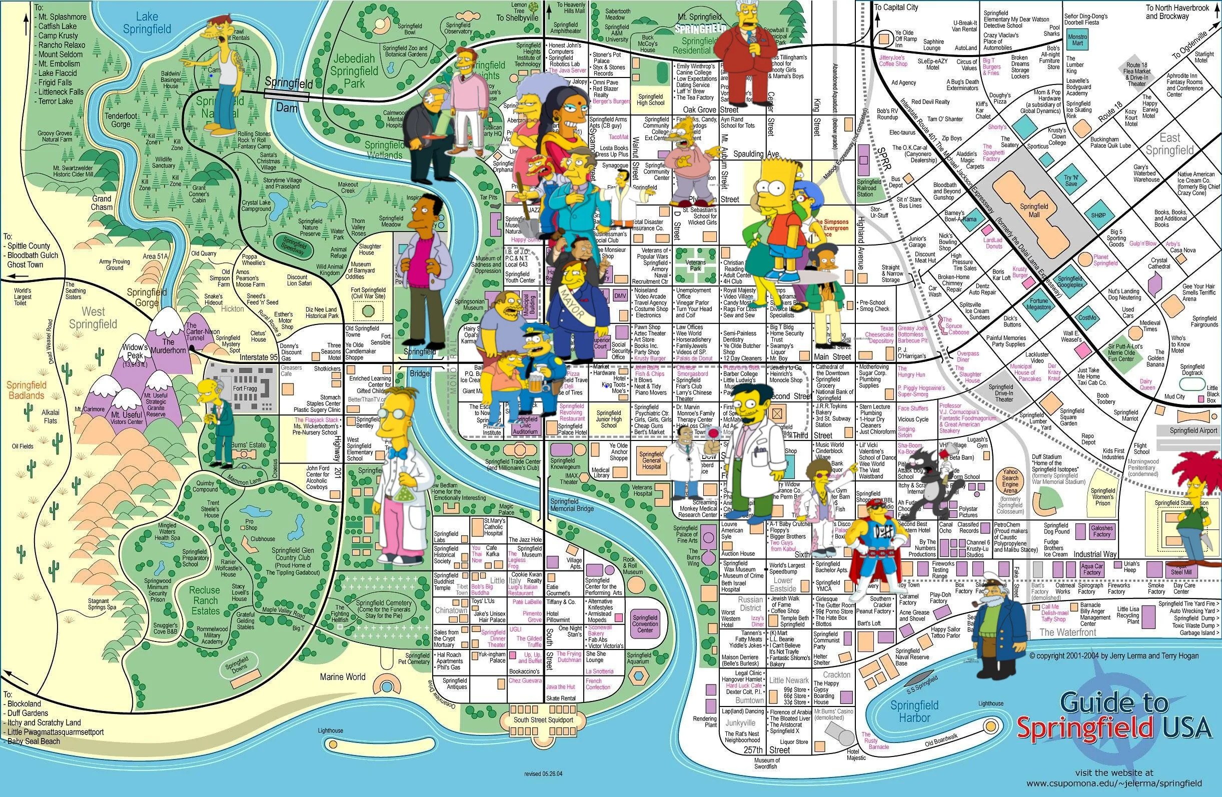
So if you’ve watched my earlier video you’ll know already that I had to go on a bit of a mission just to hunt down the map of Springfield as it was so I had zero chance of getting a shape file. So as a result I had to be creative.
Now we've already done a pretty good job of explaining how to work around this problem so for brevity, here's the original snippet from there: ‘I spent I don't want to know how long meticulously marking every single character location by hand. And just when I thought I was done, triumphantly sitting back with my nodes saved in a GIMP image editor, I found my second problem: to use this data in Python, I needed to do the whole thing again in a vector-based tool.
So I took a crash course in Inkscape. I'm definitely not a graphic artist now, but after a lot of trial and error, I had a new, beautiful set of data points that a computer could actually understand. See, I’m resourceful. I did get my Knope on after all. But my triumph was about to unravel again… ‘
So it’s this last part where I became a baby graphic designer that’s the really interesting part because that was the unlock that got me from this really cool piece of artwork to something I could actually use.
So the first thing we need to identify to be able to build this is our points of interest. These are the features we actually care about. They could be buildings, they could be suburbs, in this case I just wanted a location that I could point to that was: here, this is probably where this character hangs out.
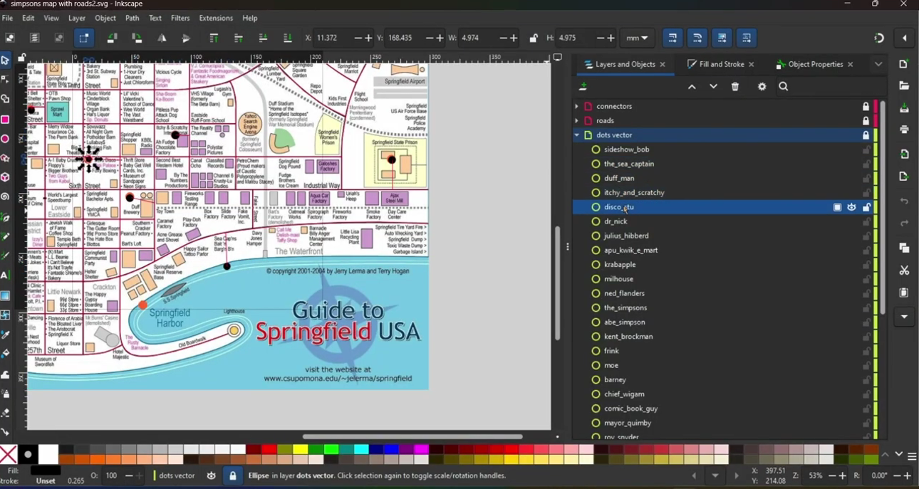
Labelled Nodes on the Springfield map
Node Identification and Path Mapping
So these are given by nodes, basically dots on the map that are centred around the point and indicate that this is something important. I labelled them all too. Look, there is one for Milhouse, there’s one for Ned Flanders, and this is important by the way because if I hadn’t done that the computer could have worked with it but it would have been near enough impossible for me to understand what it was doing.
Now the nodes were enough for me to build my basic graph, a way I could connect all of the Simpsons characters to each other via an as the crow flies distance, but as we established in that video, Bart can’t go through walls, he’s not a ghost, so the as the crow flies distances were pretty useless beyond a vague idea of how far apart everyone is.
This is the point at which I had to start drawing paths, quite literally. I used Inkscape’s vector tool to plot a line over each of the roads that represented the viable paths that Bart could travel down. Which would have been straight forward if this wasn’t like real life where roads aren’t always straight.
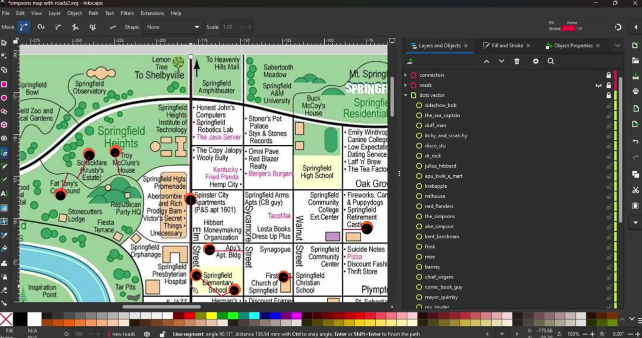
Using Inkscape to plot paths
Bridging the Gaps….Literally
Now if I’d had enough time and wasn’t fed up with the hours of work I’d put in to get to this point, I would probably have carefully drawn the curved roads by hand so that I got the perfect representation of the map. But I mentioned in another video that I have ADHD and there’s no way that I’m sitting through that so I approximated it instead.
Because if we take a triangle and add a line, it becomes a square. A square then becomes a pentagon, a pentagon a hexagon and as we add more and more lines if we did this infinitely many times we would end up with a perfect circle.
So my pragmatic approach was to just use as many little line segments as I had patience for to build the curved roads. Good enough for me.
But you know me by now, there’s always one more problem I need to solve. And in this case, it’s one of my own making.
You see, I was feeling quite defeated when I was manually marking the locations of each character after failing to get AI to do it for me, so I was just clicking them in their approximate place. But that’s actually a problem because those nodes, they’re all back from the roads. They’re hovering, isolated in space, unable to be connected. Much like if the floor was lava, our computerised Bart can’t reach the nodes if there’s no path connected to them.
My final step then was to add what I dubbed “connector paths” to bridge the gap between the nodes and the paths, but I had to be quite careful as to how I handled them. Because I put both Groundskeeper Willie and Principal Skinner in the school, but randomly, the paths could have Skinner showing up as further away than Willie, or vice versa, depending on how I drew my connector path.
Because I didn’t want this arbitrary decision to get in the way, I decided to put my connectors on a different layer in Inkscape so that I could identify them and manually set them to zero distance later on when I got to Python.
And speaking of Python, I think we’re about ready to make our way over there. Our image looks good. We have our nodes, paths and connectors that cover the gaps. I think it’s time to race home and show off our hard work to our computer.
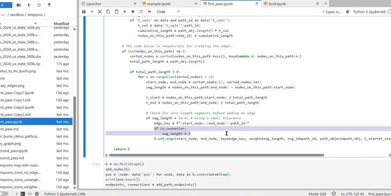
Inputting our information into Python
Working With SVG Files
Unfortunately, InkScape wasn’t the only thing I had to take a crash course in to be able to make this video. After a bit of searching around, I found out all about the packages I needed to deal with my InkScape created svg file.
One thing to know about svg files is that they basically xmls under the hood, a file format that’s been around for a long time and so plenty of packages exist to be able to work with these files programmatically. I used elementTree to import my file and used it to search through the layers to get my nodes, paths and connectors.
Turning it into a SVG file
Visualising the Graph
Now it was one thing importing the data, it was another thing actually making sense of it and I had a lot of trouble getting it correctly interpreted in the form I needed, so much so that that might be a whole other video itself, but at the end I’d built a multi-graph using the networkx package so that my PC could actually understand what it was that I was trying to tell it.
So I plotted it. Here, you can see this visually. In this example, I’ve plotted the nodes, but actually replaced them with icons of their Simpson’s characters so you can see which one is which - it’s a good job I labelled them earlier.
Replacing nodes with characters
And in this graph you can see a similar thing that I’ve done with the roads, highlighting their start and end points as well. You can see which ones are the connectors because they’re the naff little straight lines instead of the elegantly drawn paths of the original artwork.
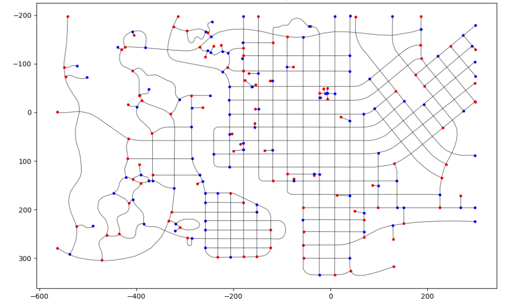
A Graph to highlight the start and end points of the roads in Springfield
We’ve only gone and done it!
In a short space of time we’ve gone from having no idea how to represent our town, Springfield in this case, in a way that we can actually do data science with and what I’ve done today is transferable to any town or city. You can just do this exact same process with a screenshot of Google Maps.
Now, one caveat I have to give you is that this manual tracing? It’s time consuming. You can use the inbuilt “trace bitmap” functionality to try and automatically determine the roads but while it might be quicker and easier, it’s often less accurate and often means later tidy up when you actually start working with the underlying data.
There are some pros to the old fashioned way beyond just data though. For example, if I’d used trace bitmap it might have identified every single building in Springfield and there are hundreds of them. I don’t care about most of them. I just care about the 32 characters on my trick or treating path. By tracing it manually, I was able to personalise the data I worked with to my problem, selecting the features that were important to me.
Besides, you’re a data scientist. What else are you going to do while waiting for your other code to finish running anyway?
Like I mentioned earlier….
Here at Evil Works we’re creating something big for data scientists, something that’s going to make your life a whole lot easier. If you want to come with us on the journey, one of the best ways you can do it is dropping into our discord server, The Evil Lair. There are some pretty resourceful people hanging out there that can help you solve exactly this kind of problem.
In the meantime, Subscribe to our You tube channel, and tell me, what’s the data science workaround you’ve done that you’re most proud of?
Come on the journey with us and keep being Evil.